First of all, I want to state the obvious… there is no such thing as an exact design process. Anyway, I am going to try my best to explain in my own words how I go about my “Design Process”. It is not something where there is a common first step. It could be thinking about the final outcome or it could be thinking about which sketchbook to use to brainstorm. For me, I like to start with a nice fresh page in my sketchbook which I always have. It is a close friend of mine and I use it to record anything and everything in my daily life including all my projects. I try to document my design development so I always write the date of the drawings, notes and sketches. I personally think this is a very good trait I have so when I want to look for something, I can find it tentatively quicker considering I can refer to the dates. It makes my life a little easier and a little bit organized if I dare say so.
-
What is it that needs to be designed?
I like to read and fully understand the requirements of the design before I start to think about the design itself. I read it maybe a couple of times or sometimes more as I tend to overlook the details in the first read. I try to come up with a name that fits the project for instance what it may actually be called if somebody gave it a name. For e.g. If I was going to be designing a casual restaurant for ants, it could be called “The Picnic Basket Bistro”. This way it is easier to have a clearer idea of what it could be. It can be changed as we go further in the design process and find a more suitable name.

Ideas for minute details. Types of furniture etc. Making notes while reading is also an important part of my beginning. The area, number of users, climate conditions: these are some of the hot points that initiate the thinking process. These notes I refer to whenever I tend to stray or stress too much on one thing. It helps focus on the important points. The first impression notes are also important in a way that it comes from a fresh perspective and your own original ideas. So, I mark and highlight important words that have been used to describe the project. I also like to allocate some space to add things later. So, that is the reason I choose a fresh page to start. It will become a nice idea page that will guide me throughout the design.
-
What do I need to know to go forward with my design?
I am not the brightest bulb that ever existed. I have tried to get out of a car with my seatbelt on on more than one occasion. So, I do my diligent research on everything that comes to my mind when I start a project. I try to find books about the topic. I like to think about some specific things that may be important pieces to a finished design like a fitting lobby space or an approachable reception. These also I research about until I have somewhat of an idea about what it might look like or where it could be or some conceptual basics that will be appended to later.
During my research, I like to have a design concept in the back of my head so that when I find something that could translate information into creativity, it can become the main design concept. A concept is a very personal thing for all designers. It is something that guides them and also helps communicate it. It can be a very subtle part of the design, used in a theme or make the design all about it. The role the concept plays depends on how the designer applies it. But that comes later, right now it is all about research.The more in-depth research you do about the design, the more complicated it gets… oh wait, I mean… the more information you have to keep in mind… no, that’s not right… the more resources you have to implement in your design.
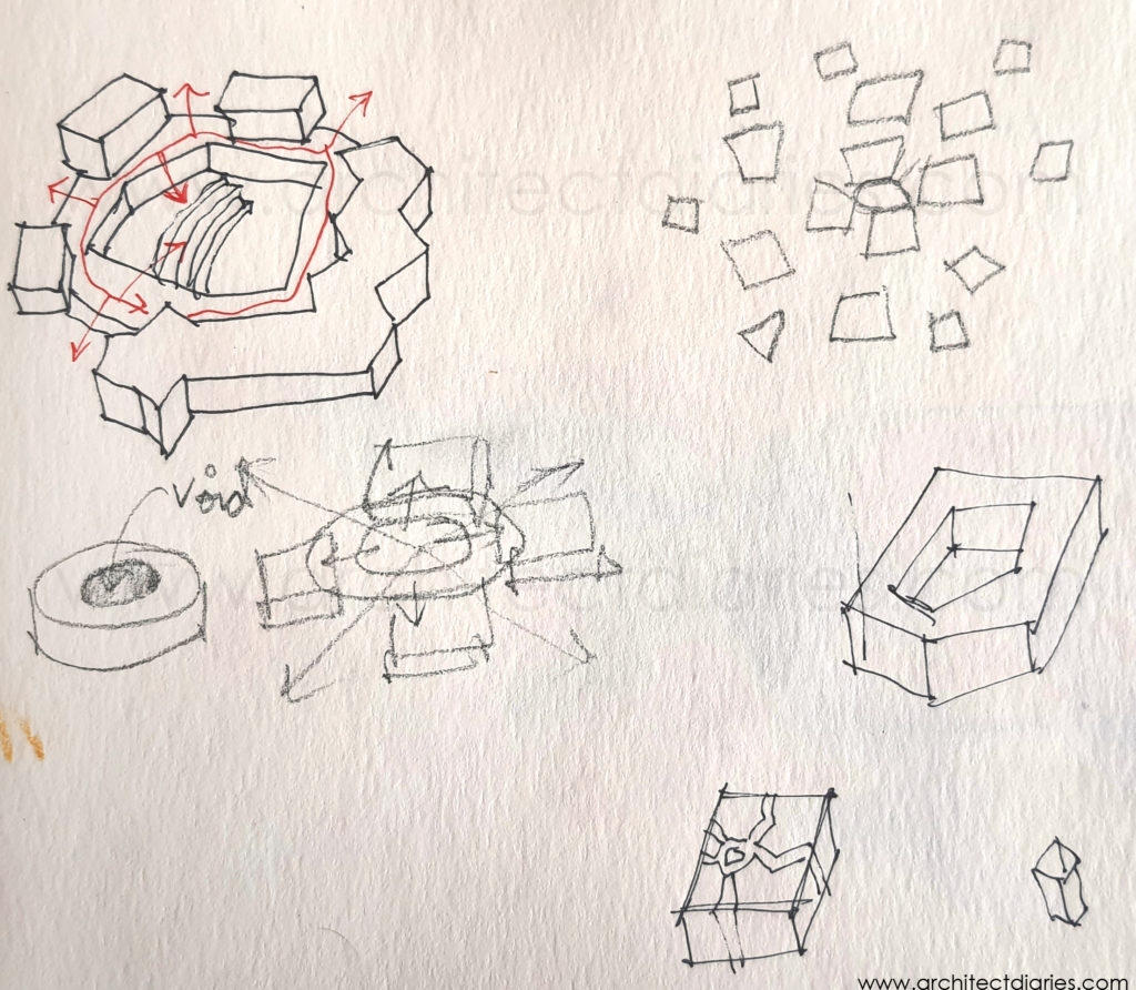
Concept development and implementation sketch -
What resources do I have at my disposal and what can I use?
I will have started to develop an idea for something for the design during research. I like to sketch and find inspiration. I also like to go back to the first page and add my own personal notes there. Some ideas I have for any nooks and crannies or about the massing. In design, it is almost impossible to find the perfect reference or resource. So, a sketchbook is your best friend. Imagination and inspiration are at work here. I try to find a similar project to understand the flow of the spaces. The interaction of the spaces with the users. The massing and architecture in regard to the surrounding situation. And whatever information that you can gather.

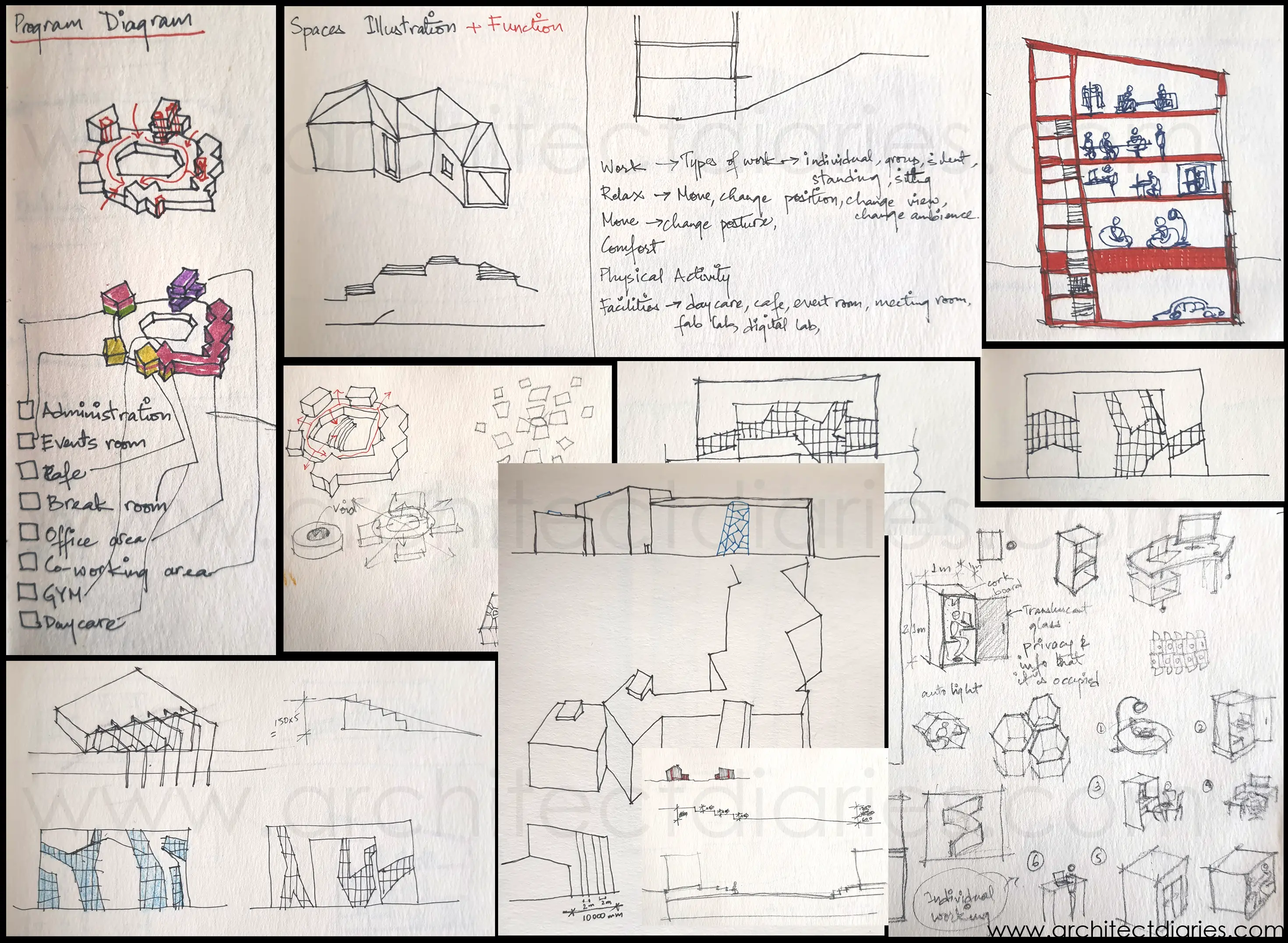
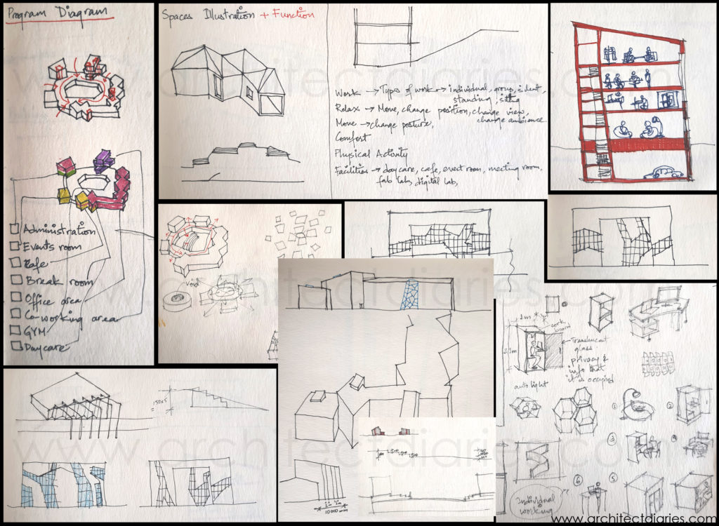
Concept development sketches 
Concept development sketches I am a big Pinterest fan. I tend to get lost in all those perfect pictures. You see where I am going with this? I just love looking at all the content for anything and everything there. I use it for inspiration. Stunningly beautiful designs are an intense source of inspiration.
-
Where is the project located?
Site analysis is next on my list. I try to find a suitable scale for the site so I can sketch the volumes of the building relatively correctly. I mostly use 1:500 or 1:1000 so it fits nicely on an A4 sheet. I use a lot of tracing sheets during this time to find a starting point I like. It is easy to work on this scale to understand the sun path, wind directions and site orientation. The points I consider during site analysis are: S.W.O.T.: Strength, Weakness, Opportunity and Threat. These are great pointers to get started to understand a site. It is also nice to be able to visit the site, and take in the ambience of the place, make some measurements, analyze the traffic and ask about any obstacles or opportunities. It is much easier to visualize the contours of the site from visiting it than just seeing it on paper.
During the site analysis, I also like to learn the regulations and permissions for the site area. It is best to be clear about these first. So, when sketching on the site plan, the regulations are considered from the beginning of the design. When I have a basic outline, I then move on to the next step. -
Where does everything go?
Now is the time to apply the concept. I have made points about what is needed, I know the site well, I have information to implement in my design process; now I start placing spaces on my site according to the concept. Massing and zoning, I do simultaneously as I find it easier to visualize. I try to map out spaces and their connections inside the outline I sketched out earlier. I make circles of different sizes according to the space requirement and connect them with different lines that depict the type of connection. (see my other project for an example) Then I move them around to find the best location and convenient connections. I do separate zoning diagrams for different floors and use a distinct same color for where the vertical connection lies like elevators and stairs.
This is also a great tool to present your design. I tend to have a zoning diagram in most of my design presentations. Diagrams help structure the design. It is also helpful to have a sun path diagram to help locate places that need natural light the most in the correct location. As I have a better idea of the design in the smallest scale, I like to move the design to a bigger scale and study and design the space more closely.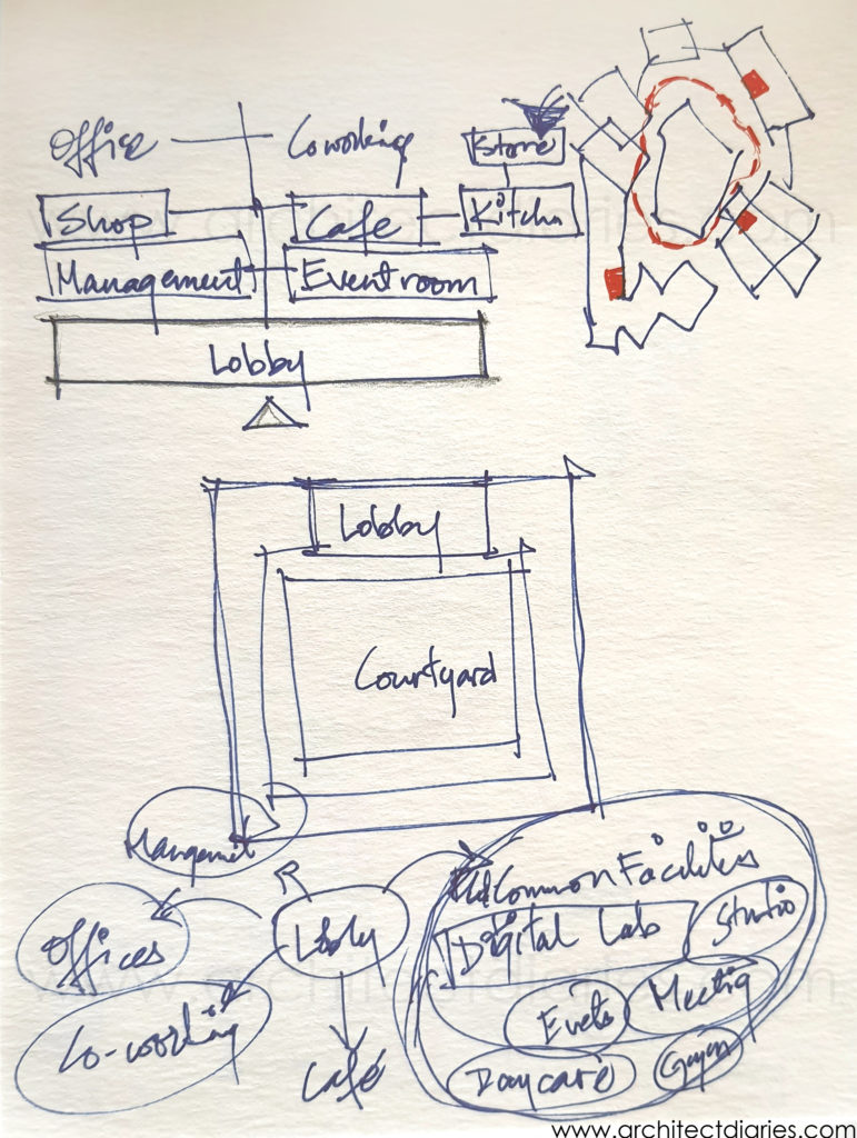
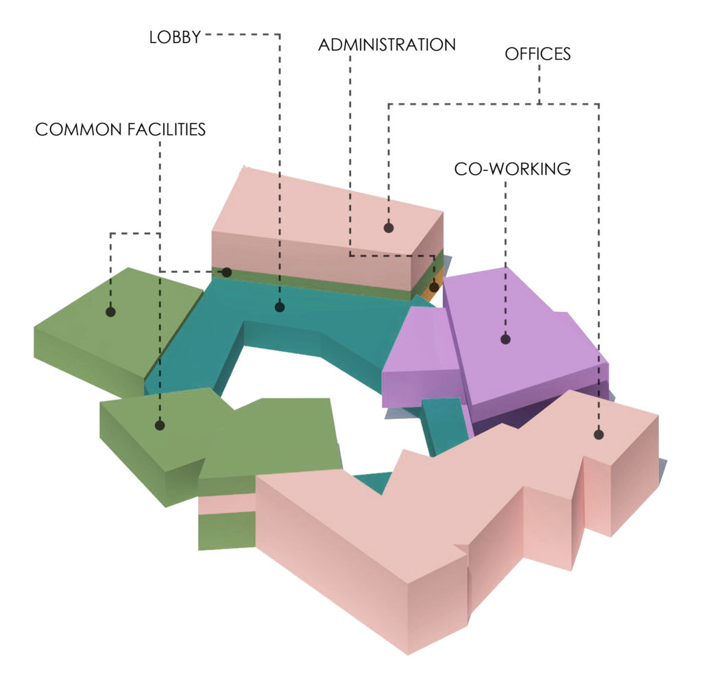
Basic zoning diagram that shows primary connections and flow in the building -
What will it look like?
Studying the space on a bigger scale means getting a better idea of the place, so I like to sketch out some perspective views to better communicate my design. I try to channel the spirit of the concept in the perspective views as they are the parts that convey the conceptual idea the best. For me, what the design concept means is what the users of the space feel when using it. It can invoke a sense of serenity in the form of soft light in the morning. It could inspire the expression of creativity in an empty space. These are what need to be decided when choosing the concept for the design. A design concept can be about the whole complex or a single wall. It all depends how the designer chooses to express it.
I keep referring to my first page to stay on track about the requirements of design. And I check to see if there are any ideas and notes that may be useful to apply in any part of the project. It is also helpful to review the development sketches and previous ideas. I keep detailing it to best represent the concept. I imagine the building being used and what the user might see and feel as they are walking through these spaces. It helps decide the ambience of the space. A waiting area may have an interesting view instead of a clock to make the wait feel short.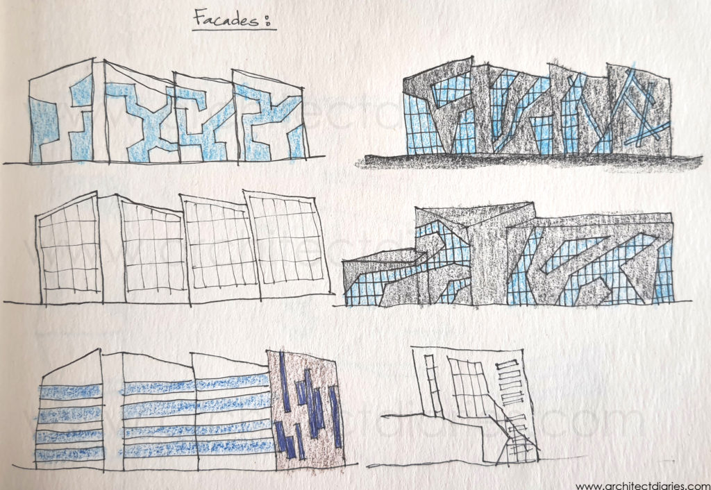
Translation of concept sketch to implementation
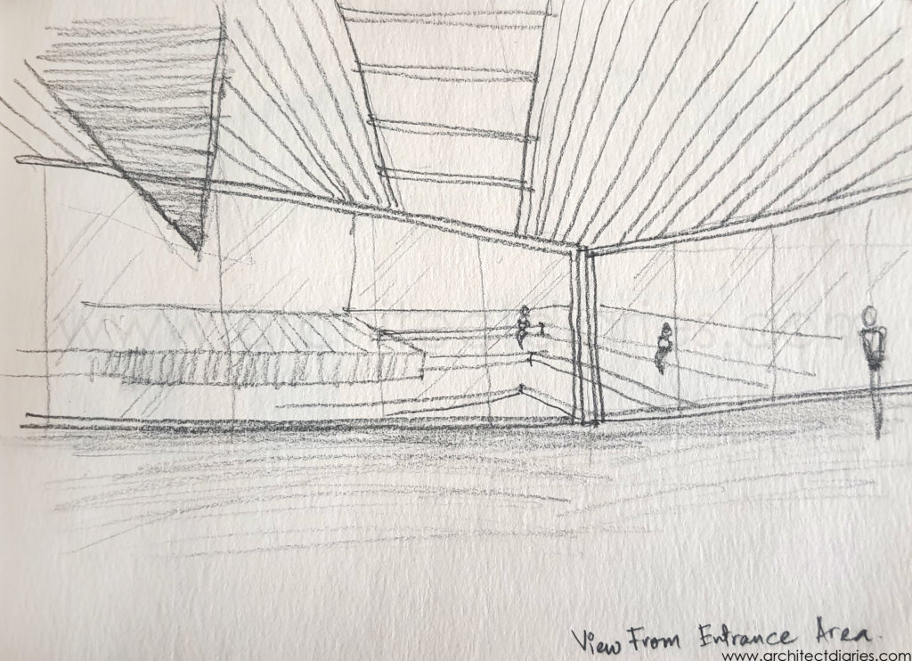
This is my process for a design. I go back and forth all these steps to achieve my desired final product but; a design is never finished. I use many tools for my design like scale models, 3D programs, etc. It is a creative process, an art and the finished piece is an art piece, an expression of own creativity.
See my completed project here:
The Void – Information Technology Park
